
")
Because nothing beats a (good) tutorial to understand and learn, I suggest you follow this series of articles which will allow you to discover HTML code and the creation of overrides in Joomla. In order to explain the entire design and then production process in detail, we are going to design an e-commerce page from A to Z including the following three parts:
- the presentation of a product with its title, its description, a shopping cart button, its price and a slideshow to display different images of the product,
- a comparison table with differents products related to the item,
- and some complementary products, also related to the item.
In this first tutorial, we will see in detail how to design and realize these three parts in HTML code. These will be static, that is to say that the contents will not change until you modify the code.
In the second tutorial, we will see how to prepare our content, how to organize it in order to make these parts dynamic, that is to say that the contents will change automatically as soon as you update an article or a module in Joomla.
And finally in the third and last tutorial, I'll show you how to create the overrides in Joomla to get the next product page:
Creation of a product page using overrides in Joomla
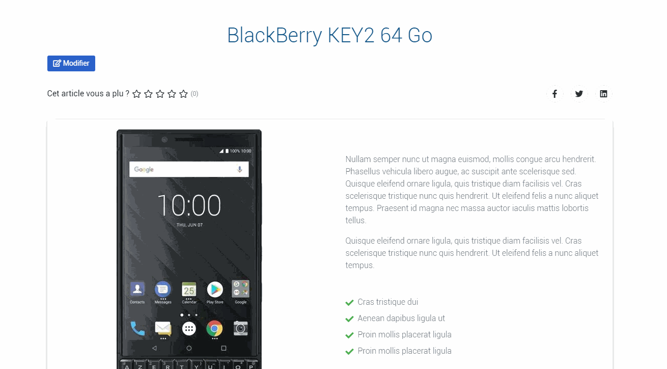
The product sheet
Before starting, this is what our product sheet will look like:

Basically, our product sheet is made up of two distinct parts:
- On the left: the slideshow with the product images,
- On the right: the product description and the add to cart button.
Let's translate this into HTML with Bootstrap 4 classes. Our product sheet will look roughly like this:
<section>
	<div class="row">
		<div class="col-lg-6">
			The slideshow goes here
		</div>
		<div class="col-lg-6">
			The description goes here
		</div>
	</div>
</section>
The slideshow
To display a slideshow, it's pretty simple because it's a Bootstrap 4 native component. We copy / paste the slideshow code into the first part of our code, which gives us this:
<div id="carousel-thumb" class="carousel slide carousel-thumbnails" data-ride="carousel">
	<div class="carousel-inner text-center text-md-left" role="listbox">
		<div class="carousel-item active">
			<img src="url/to/my/image.jpg" alt="" class="img-fluid">
		</div>
		<div class="carousel-item">
			<img src="url/to/my/image.jpg" alt="" class="img-fluid">
		</div>
		<div class="carousel-item">
			<img src="url/to/my/image.jpg" alt="" class="img-fluid">
		</div>
	</div>

	<a class="carousel-control-prev" href="#carousel-thumb" role="button" data-slide="prev">
		<span class="carousel-control-prev-icon" aria-hidden="true"></span>
		<span class="sr-only">Previous</span>
	</a>
	<a class="carousel-control-next" href="#carousel-thumb" role="button" data-slide="next">
		<span class="carousel-control-next-icon" aria-hidden="true"></span>
		<span class="sr-only">Next</span>
	</a>
</div>
Of course, you can add other images to your slideshow, taking care to copy / paste the corresponding lines. If your images are not showing, check that the URL address of the images is correct.
If you want to be able to adjust the slideshow's scrolling speed, here is a small JavaScript code snippet to add before the slideshow:
<script>$('.carousel').carousel({
		interval: 6500
	})
</script>
You just need to modify the content of the variable to change the scrolling speed.
The description
Without realizing it and in a few minutes, you have already completed half of your product sheet! But we do not stop there.
Now let's move on to the second part of our product sheet with the description.
If we look in more detail from top to bottom, we have a text, a list, a button and a price. Nothing really very complicated here, we just need to be methodical and add our different elements one after the other. To help you understand how this part is built, I have taken care to detail each sub-part.
The product description
<p class="text-muted font-weight-light ml-3 mb-5">Proin a risus sodales, hendrerit odio non, condimentum augue. Vivamus id libero ante. In sem diam, semper vel sodales et, placerat a turpis. Suspendisse tristique diam mattis, venenatis metus ut cursus.</p>The list
<ul class="fa-ul mb-5 text-muted font-weight-light">
	<li class="mb-2"><span class="fa-li"><i class="fas fa-check green-text"></i></span>Morbi at iaculis nisl</li>
	<li class="mb-2"><span class="fa-li"><i class="fas fa-check green-text"></i></span>Donec ac lectus ut mist</li>
	<li class="mb-2"><span class="fa-li"><i class="fas fa-check green-text"></i></span>Vivamus luctus odio vitae</li>
	<li class="mb-2"><span class="fa-li"><i class="fas fa-check green-text"></i></span>Duis porttitor enim eu mollis</li>
</ul>
The price and the button
<div class="d-flex justify-content-between ml-3">
		<button type="button" class="btn btn-primary mx-0">Purchase</button>
		<div class="text-center">
			<h4 class="mb-0">$399</h4>
			<small class="grey-text">+ $10 shipping fees</small>
		</div>
	</div>
There you go, all that remains is to add these three sub-parts in our starting code and we will have finished our product sheet. This gives us the following code:
<section class="mb-5">

	<!-- Section title -->
	<h3 class="text-center font-weight-bold mb-5">Our Great Product</h3>

	<div class="row">
		<div class="col-md-12">
			<div class="card">
				<div class="card-body">
					<div class="row h-100 d-flex align-items-center">
						<div class="col-lg-6">

							<!-- Slideshow -->
							<div id="carousel-thumb" class="carousel slide carousel-thumbnails" data-ride="carousel">
								<div class="carousel-inner text-center text-md-left" role="listbox">
									<div class="carousel-item active">
										<img src="url/to/my/image.jpg" alt="" class="img-fluid">
									</div>
									<div class="carousel-item">
										<img src="url/to/my/image.jpg" alt="" class="img-fluid">
									</div>
									<div class="carousel-item">
										<img src="url/to/my/image.jpg" alt="" class="img-fluid">
									</div>
								</div>

								<a class="carousel-control-prev" href="#carousel-thumb" role="button" data-slide="prev">
									<span class="carousel-control-prev-icon" aria-hidden="true"></span>
									<span class="sr-only">Previous</span>
								</a>
								<a class="carousel-control-next" href="#carousel-thumb" role="button" data-slide="next">
									<span class="carousel-control-next-icon" aria-hidden="true"></span>
									<span class="sr-only">Next</span>
								</a>
							</div>
							<!-- /Slideshow -->

						</div>
						<div class="col-lg-6">

							<!-- Description -->
							<p class="text-muted font-weight-light ml-3 mb-5">Proin a risus sodales, hendrerit odio non, condimentum augue. Vivamus id libero ante. In sem diam, semper vel sodales et, placerat a turpis. Suspendisse tristique diam mattis, venenatis metus ut cursus
							</p>

							<!-- Product features -->
							<ul class="fa-ul mb-5 text-muted font-weight-light">
								<li class="mb-2"><span class="fa-li"><i class="fas fa-check green-text"></i></span>Morbi at iaculis nis</li>
								<li class="mb-2"><span class="fa-li"><i class="fas fa-check green-text"></i></span>Donec ac lectus ut mist</li>
								<li class="mb-2"><span class="fa-li"><i class="fas fa-check green-text"></i></span>Vivamus luctus odio vitae</li>
								<li class="mb-2"><span class="fa-li"><i class="fas fa-check green-text"></i></span>Duis porttitor enim eu mollis</li>
							</ul>

							<!-- Button and price -->
							<div class="d-flex justify-content-between ml-3">
								<button type="button" class="btn btn-primary mx-0">Acheter</button>
								<div class="text-center">
									<h4 class="mb-0">399 €</h4>
									<small class="grey-text">+ 10 € frais de port</small>
								</div>
							</div>

						</div>

					</div>
				</div>
			</div>
		</div>

	</div>
</section>
First step completed !
Now let's move on to the product comparison table.
The comparison table
To tease you, here's what our comparison table will look like:
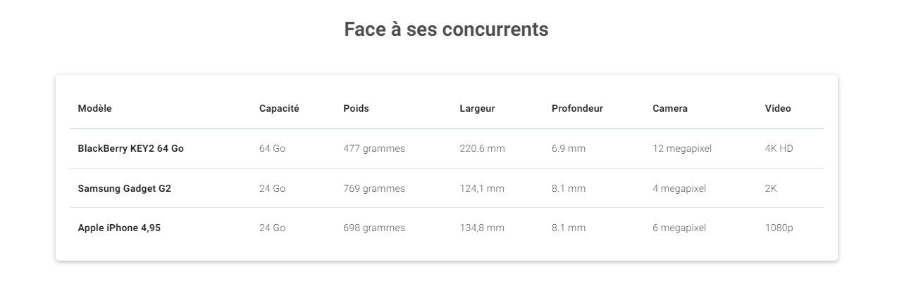
Without surprises, our table is made ... with an HTML table!
To display a table, there is nothing simpler since it is a Bootstrap 4 element. We copy / paste the code of the table, which gives us this :
<table class="table table-responsive-md mb-0">
		<thead>
			<tr>
				<th scope="col">#</th>
				<th scope="col">Heading</th>
				<th scope="col">Heading</th>
				<th scope="col">Heading</th>
			</tr>
		</thead>
		<tbody>
			<tr>
				<th scope="row">1</th>
				<td>Cell</td>
				<td>Cell</td>
				<td>Cell</td>
			</tr>
			<tr>
				<th scope="row">2</th>
				<td>Cell</td>
				<td>Cell</td>
				<td>Cell</td>
			</tr>
			<tr>
				<th scope="row">3</th>
				<td>Cell</td>
				<td>Cell</td>
				<td>Cell</td>
			</tr>
		</tbody>
	</table>
For fun, we're going to flip the table showing the information in rows, not in columns. Add the lines and the content and you're done!
<div class="card">
	<div class="card-body">
		<table class="table table-responsive-md mb-0">
			<thead>
				<tr>
					<th><strong>Ref</strong>
					</th>
					<th>
						<strong>Memory;</strong>
					</th>
					<th>
						<strong>Weight</strong>
					</th>
					<th>
						<strong>Width</strong>
					</th>
					<th>
						<strong>Depth</strong>
					</th>
					<th>
						<strong>Camera</strong>
					</th>
					<th>
						<strong>Video</strong>
					</th>
				</tr>
			</thead>
			<tbody>
				<tr>
					<th scope="row"><strong>BlackBerry KEY2 64 Go</strong></th>
					<td>64 Go</td>
					<td>477 grammes</td>
					<td>220.6 mm</td>
					<td>6.9 mm</td>
					<td>12 megapixel</td>
					<td>4K HD</td>
				</tr>
				<tr>
					<th scope="row"><strong>Samsung Gadget G2</strong></th>
					<td>24 Go</td>
					<td>769 grammes</td>
					<td>124,1 mm</td>
					<td>8.1 mm</td>
					<td>4 megapixel</td>
					<td>2K</td>
				</tr>
				<tr>
					<th scope="row"><strong>Apple iPhone 4,95</strong></th>
					<td>24 Go</td>
					<td>698 grammes</td>
					<td>134,8 mm</td>
					<td>8.1 mm</td>
					<td>6 megapixel</td>
					<td>1080p</td>
				</tr>
			</tbody>
		</table>
	</div>
</div>
It's hard to get simpler and faster. The interest here is to see and understand how an HTML table is constructed. This will allow us to better understand the phase of realization of the corresponding override.
Second step sompleted, let's move on to the last part with the presentation of complementary products.
The complementary products
Without further ado, this is what the last part of our e-commerce page will look like:

Basically, we have three products with for each: an image, a title and a price. You will have noticed that some products may also display a badge.
The markup
To create this aprt, we will use Cards which is a Bootstrap 4 native component.
This is what the HTML structure of this part will look like:
<section>
    <div class="row">

		<div class="col-lg-4 col-md-6 mb-4">
			<div class="card align-items-center">
				<!-- 1st card -->
			</div>
		</div>

		<div class="col-lg-4 col-md-6 mb-4">
			<div class="card align-items-center">
				<!-- 2nd card -->
			</div>
		</div>

		<div class="col-lg-4 col-md-6 mb-4">
			<div class="card align-items-center">
				<!-- 3rd card -->
			</div>
		</div>

	</div>
</section>
So on desktop, we will have the three cards side by side. On tablet, we will have 2 and they will be displayed one after the other on mobile.
Now let's look at how to build a card.
Bootstrap Cards
The first part displays the product image. For an optimal and elegant rendering, remember to use quality images and if possible, all having the same dimensions. We also add a specific CSS class to get a slight visual effect on the image when hovering the mouse. Here is the code for this part:
<div class="view overlay">
	<img src="url/to/my/image.jpg" class="card-img-top" alt="">
	<a>
		<div class="mask rgba-white-slight"></div>
	</a>
</div>
The second part will display the rest of the information, namely and in order: the title of the product, possibly the badge and finally, the price. Which gives us the following HTML code:
<div class="card-body text-center">

	<h5 class="mb-3">
		<strong>
			<!-- Title -->
			<a href="" class="dark-grey-text">Produit
				<!-- Badge -->
				<span class="badge badge-pill danger-color">Badge</span>
			</a>
		</strong>
	</h5>
	<h5 class="font-weight-bold blue-text mb-0">
		<!-- Price -->
		<strong>000 €</strong>
	</h5>
</div>
I have commented on this code so that you can find the different parts more easily.
Now that we have our image and our information, we just have to group everything together and build all the code for this part:
<section class="dark-grey-text text-center">
    <div class="row">

		<div class="col-lg-4 col-md-6 mb-4 d-flex align-items-stretch">
			<!-- Card -->
			<div class="card align-items-center">

				<!-- Product image -->
				<div class="view overlay">
					<img src="url/to/my/image.jpg" class="card-img-top" alt="" />
					<a>
						<div class="mask rgba-white-slight"></div>
					</a>
				</div>

				<!-- Card content -->
				<div class="card-body text-center">

					<h5 class="mb-3">
						<strong>
							<!-- Title -->
							<a href="" class="dark-grey-text">Produit
								<!-- Badge -->
								<span class="badge badge-pill danger-color">Badge</span>
							</a>
						</strong>
					</h5>
					<h5 class="font-weight-bold blue-text mb-0">
						<!-- Price -->
						<strong>000 €</strong>
					</h5>
				</div>
			</div>
		</div>

		<div class="col-lg-4 col-md-6 mb-4 d-flex align-items-stretch">
			<div class="card align-items-center">
				<div class="view overlay">
					<img src="url/to/my/image.jpg" class="card-img-top" alt="" />
					<a>
						<div class="mask rgba-white-slight"></div>
					</a>
				</div>
				<div class="card-body text-center">
					<a href="" class="grey-text">
						<h6>catégorie</h6>
					</a>
					<h5 class="mb-3">
						<strong>
							<a href="" class="dark-grey-text">Produit</a>
						</strong>
					</h5>
					<h5 class="font-weight-bold blue-text mb-0">
						<strong>000 €</strong>
					</h5>
				</div>
			</div>
		</div>

	</div>
</section>
Conclusion
And there you have it, you have just finished the first part of this tutorial. Admit that it was less complicated than you imagined!
Take the time to reread the different parts, to test, modify and why not, improve these codes so that they are perfectly suited to the design of your site.
We'll meet in few days to transform these three parts into dynamic elements thanks to Joomla and overrides.

