Responsive Tables - Documentation
1. Installation
To install the extension, simply access your Joomla administrator panel and open System in the left menu. Then, click on Extensions in the Installation panel.
Open the tab Upload package file, click on the button and locate the ZIP archive plg_responsive_tables_J4.zip on your computer. Select it to launch the installation process.
Few seconds later, a message confirm you that the process of installation is successfuly completed.
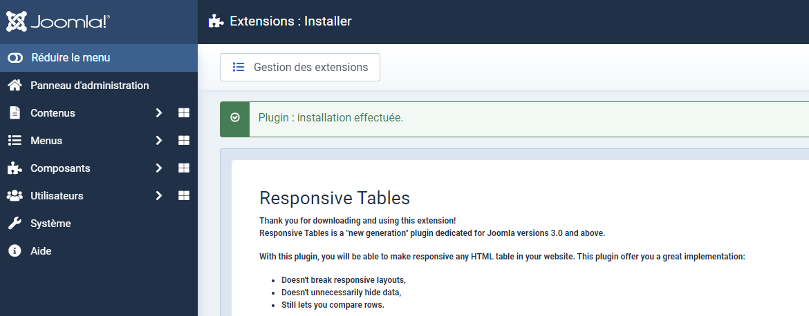
Now, your extension Responsive Tables is available in your Plugin manager.
Don't forget to enable the plugin:
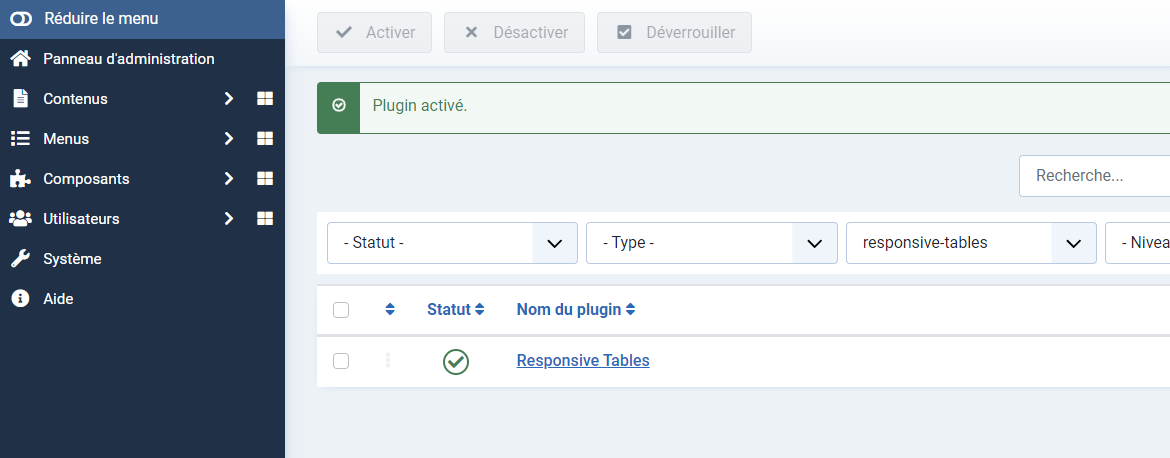
2. Setup
2.1 The HTML table
Let's create a first responsive HTML table.
Open or create an article.
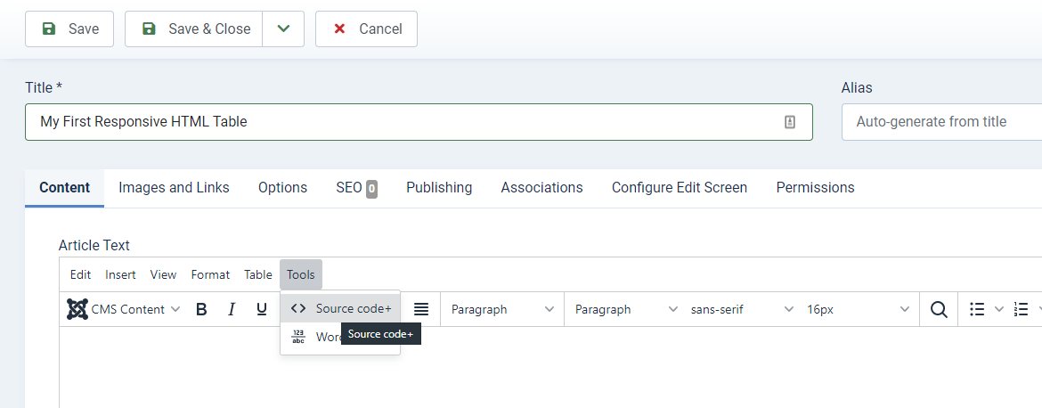
To insert your HTML table, you must access to the source code option of the text editor.
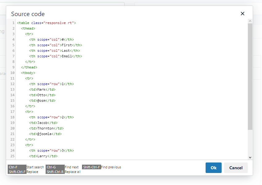
Now in the popup, add your HTML code.
Here, you must add the CSS class responsive rt to the table tag to get the responsive effect on your HTML table.
<table class="responsive rt">
	<thead>
		<tr>
			<th scope="col">#</th>
			<th scope="col">First</th>
			<th scope="col">Last</th>
			<th scope="col">Email</th>
		</tr>
	</thead>
	<tbody>
		<tr>
			<th scope="row">1</th>
			<td>Mark</td>
			<td>Otto</td>
			<td>@osm</td>
		</tr>
		<tr>
			<th scope="row">2</th>
			<td>Jacob</td>
			<td>Thornton</td>
			<td>@joomla</td>
		</tr>
		<tr>
			<th scope="row">3</th>
			<td>Larry</td>
			<td>the Bird</td>
			<td>@nba</td>
		</tr>
	</tbody>
</table>
Example of HTML table code
Save your article.
Now, your responsive HTML table is ready to be displayed.
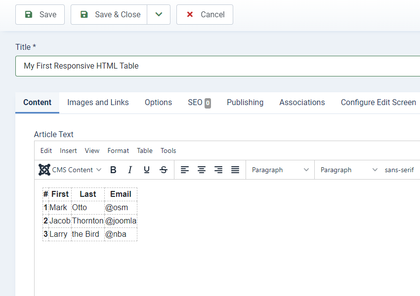
Other option
You can also use the table button of your text editor and add your HTML table with it. To add the CSS class responsive rt to the table tag, you must toggle your text-editor by clicking the buttom below the text-editor.
width and/or a height to your HTML table. Otherwise, it will break the responsive effect.Click on Save once you're done.
3. Display
Here are some advices based on my experience and on users feedbacks.
- Images: Please, do not display images or medias in your tables. The plugin "Responsive Tables" DOES NOT resize pictures or videos. If you want/need to display images or media on your website, the best web design practice is using the tag
div. Remind that tables are displaying datas
- Tag width: If you indicate a width to your table like
<table class="responsive rt" width="560">, this will break the Responsive Design because this rule will be applyed over the plugin and the table will be displayed with this width on all devices. So, don't indicate any width and/or height rule on your HTML tables.
- Notice on localhost: on some local installations, a notice message could be displayed
Notice: Undefined variable: baseurl in C:\xampp\htdocs\Joomla\plugins\content\responsive-tables\responsive-tables.php on line 17This is a notice, not an error or an issue. The plugin works fine and your HTML table will be correctly displayed on frontend on your live server without any notice.
4. Demo