
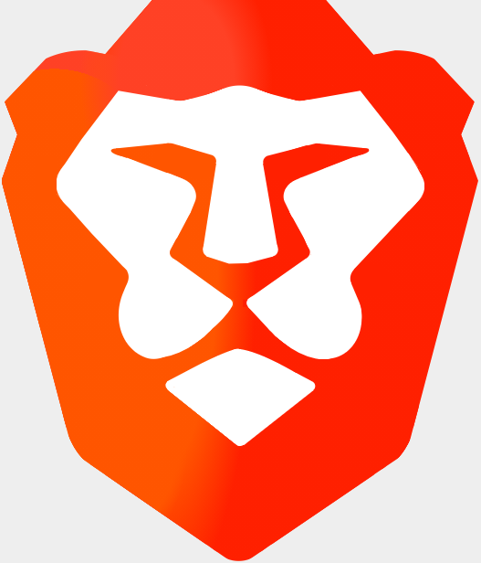
Nowadays, CSS is considered the soul of web development. From styling a text to creating complex shapes with gradient, CSS can do almost anything. In this tutorial, we'll discover a creative way to replicate the Brave logo with CSS.
If you don't know yet this privacy-oriented browser, you should give it a try ASAP!
The Brave logo in CSS
Step 1. The Structure
First, take a cup of coffee and get started.
To create the Brave logo, we need a container and a wrapper. And they are also few <div> elements.
The container element would hold all the nested elements and the wrapper would maintain the aspect ratio of the graphic. Let's assume the following code snippet.
<div class="brave-logo">
<div class="logo">
	<div class="wrapper">
		<div class="mask">	<!-- shape -->
			<div class="i">	<!-- inner figure -->
				<div class="b b1"></div>
				<div class="b b2"></div>
				<div class="b b3"></div>
				<div class="b b4"></div>
				<div class="b b5"></div>
				<div class="b b6"></div>
				<div class="b b7"></div>
				<div class="b b8"></div>
				<div class="b b9"></div>
				<div class="b b10"></div>
				<div class="b b11"></div>
				<div class="b b12"></div>
			</div>
			<div class="e">	<!-- extended inner figure -->
				<div class="b b13"></div>
				<div class="b b14"></div>
			</div>
		</div>
	</div>
</div>
</div>
Here, the .logo class is the container element and the .wrapper class is the wrapper, of course.
The wrapper contains all the curved shapes that we need to create the inner figure.
.brave-logo {
    position: relative;
    left: 0;
    top: 0;
    overflow: hidden;
    display: inline-block;
}

.brave-logo .logo {
    --primary-color: #FF2000;
    --secondary-color: #FF5500;
    --fill-color: #FFF;
    --reflection-color: #FF4125;

    position: relative;
    left: 0;
    top: 0;
    width: 768px;
    height: 768px;
    box-shadow: 0 0 0 1px rgba(0,0,0,0);
}
In the above code snippet, we declared the logo dimensions and colors we need for the work.
We took 768px for the with as initial dimensions to match the source graphic.
Step 2. Creating the basic shape
Although the source graphic is geometric, it's possible to create a rough shape to fill most of the space .clip-path can do this very efficiently, also clip-path: polygon() has a good browser support at present. You can find more details about this property at CanIUse.
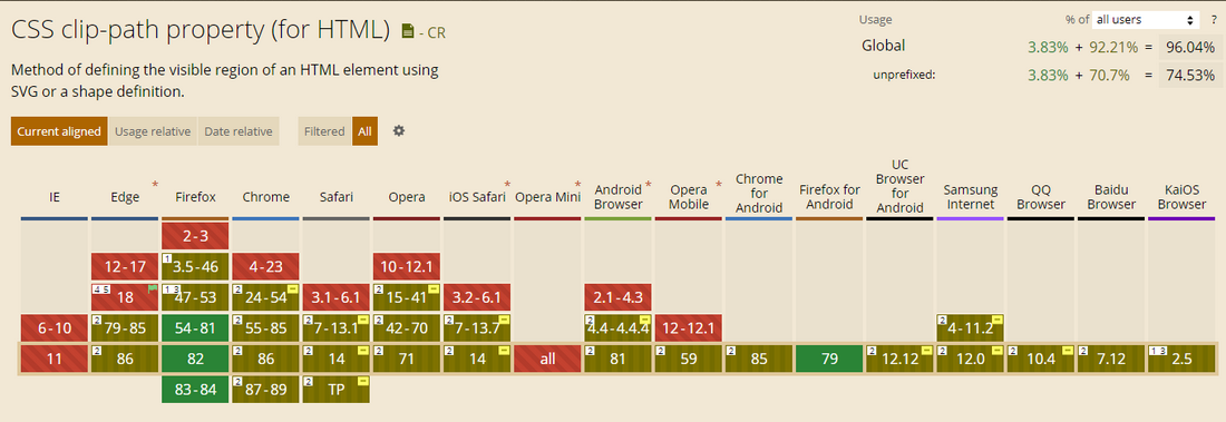
To set the polygon coordinates, we can use a very cool tool called Clippy. Feel free to play with Clippy here.
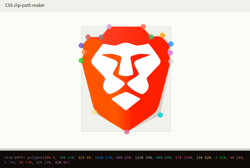
The visual tool gives us:
clip-path: polygon(67% -1%, 78% 9.77%, 88% 8%, 99.2% 18.1%, 96.4% 24%, 100% 32.2%, 85% 80.6%, 49.7% 101%, 14.9% 80.6%, -0.1% 32.2%, 3.25% 24%, 0.59% 18.1%, 12% 8%, 21.7% 9.67%, 32.6% -1%);
.brave-logo .wrapper {
    position: absolute;
    left: 50%;
    top: 0;
    width: 85%;
    height: 100%;
    transform: translateX(-50%);
    clip-path: polygon(67% -1%, 78% 9.77%, 88% 8%, 99.2% 18.1%, 96.4% 24%, 100% 32.2%, 85% 80.6%, 49.7% 101%, 14.9% 80.6%, -0.1% 32.2%, 3.25% 24%, 0.59% 18.1%, 12% 8%, 21.7% 9.67%, 32.6% -1%);
    background-color: black; /* for testing */
    display: block;
    overflow: hidden; /* set boundaries */
}
...and we got:

Don't worry, we'll fine-tune the coordinates later.
Step 3. Rounded corners and color shades
We can use gradients as layers! So to create rounded corners, we can do something like this:
.brave-logo .wrapper::before{
background-image:
		/* left radius */
		linear-gradient(var(--secondary-color),var(--secondary-color)),
		radial-gradient(ellipse at 50% 50%, var(--secondary-color) 50%, transparent 50.5%),

		/* right radius */
		linear-gradient(var(--primary-color),var(--primary-color)),
		radial-gradient(ellipse at 50% 50%, var(--primary-color) 50%, transparent 50.5%),

		/* bottom radius */
		linear-gradient(var(--primary-color),var(--primary-color)),
		radial-gradient(ellipse at 50% 50%, var(--primary-color) 50%, transparent 50.5%),

		/* ears */
		radial-gradient(ellipse at 50% 50%, var(--reflection-color) 50%, transparent 50.6%),
		radial-gradient(ellipse at 50% 50%, var(--primary-color) 50%, transparent 50.6%),

		/* body */
		linear-gradient(var(--primary-color), var(--primary-color)),
		linear-gradient(var(--primary-color), var(--primary-color));

background-size:
		 12% 5%,
		 28% 39%,
		 12% 5%,
		 28% 39%,
		 50% 16%,
		 32% 48%,
		 49% 37%,
		 49% 37%,
		 100% 58%,
		 56.4% 97%;

background-position:
		 21% 86%,
		 11.46% 82.72%,
		 78% 86%,
		 88.46% 82.9%,
		 49.7% 98%,
		 49.58% 113.3%,
		 -14.3% 5.7%,
		 114% 5.7%,
		 50% 43.43%,
		 49.7% 0%;
}
And we can use same approach goes for the color shades:
.brave-logo .wrapper::after{
background-image:
		 linear-gradient(var(--secondary-color),var(--secondary-color)),
		 radial-gradient(ellipse at 50% 50%, var(--reflection-color) 30%, transparent 50%),
		 radial-gradient(ellipse at 50% 50%, var(--secondary-color) 40%, transparent 50%),
		 radial-gradient(ellipse at 50% 50%, var(--secondary-color) 50%, transparent 50%),
		 linear-gradient(var(--primary-color), var(--primary-color)),
		 radial-gradient(ellipse at 50% 50%, var(--secondary-color) 30%, transparent 50%),
		 radial-gradient(ellipse at 50% 50%, var(--secondary-color) 50%, transparent 50%);

background-size:
		 41% 20%,
		 57% 73%,
		 30% 50%,
		 66% 66%,
		 50% 27%,
		 57% 176%,
		 67% 66%;

background-position:
		 10% 29%,
		 19% -82%,
		 19% 107%,
		 -66% 57%,
		 58% -4%,
		 11% 55%,
		 -68% 7.5%;
}
...and also we make it full-width and absolute:
.brave-logo .wrapper::before,
.brave-logo .wrapper::after{
    content: "";
    position: absolute;
    left: 0;
    top: 0;
    width: 100%;
    height: 100%;
    display: block;
    background-repeat: no-repeat;
}

.brave-logo .wrapper{
background-color: transparent;
}

This lengthy CSS code saved 8 elements, so it's a good investment.
Step 4. The inner figure
Though we've added all details in the background, let's work with the inner figure now.
.brave-logo .mask{ /* mask only the inner figure */
    position: absolute;
    left: 50%;
    top: 15.2%;
    height: 64.323%;
    width: 77.41%;
    z-index: 4;
    transform: translateX(-50%);
    overflow: hidden;
}

.brave-logo .mask > .i,
.brave-logo .mask > .e{
    position: absolute;
    left: 0;
    z-index: 5;
    background-repeat: no-repeat;
}
As mentioned in Step-2, we'll create a rough fill for the inner figure as well.
.brave-logo .mask::before{
content: "";
position: absolute;
left: 0;
top: 0;
width: 100%;
height: 100%;
background-color: var(--fill-color);
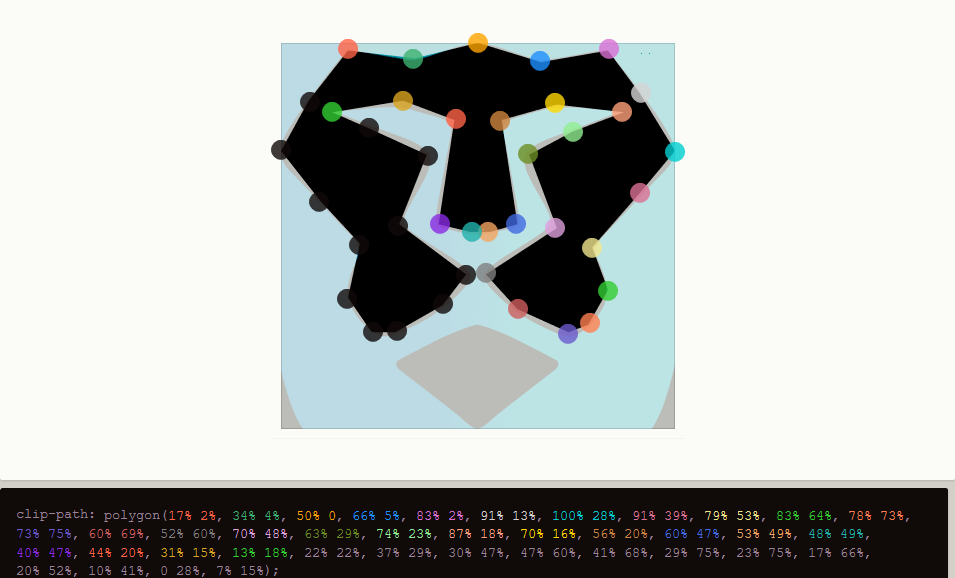
clip-path: polygon(17% 1.5%, 34% 4.5%, 50% 0.2%, 66% 4.5%, 82.6% 1.5%, 91.5% 13%, 102% 28%, 91.9% 39%, 79% 53%, 82.5% 64%, 77.2% 73%, 73% 75%, 58.2% 68%, 51% 60.1%, 69.2% 47%, 62.2% 29%, 73% 23%, 86.6% 17.7%, 70% 16%, 56% 20.4%, 60.5% 47%, 52% 49.3%, 47% 49.4%, 39.7% 47%, 43.8% 20%, 31% 16%, 13% 17.8%, 21.6% 21%, 37.5% 29%, 30.7% 47%, 48.2% 59.9%, 41.8% 68%, 30% 75%, 24% 75%, 17.4% 66%, 20.4% 52.5%, 9.7% 41%, -1.6% 28%, 7% 15%);
}
.brave-logo .mask::after{
content: "";
position: absolute;
left: 0;
top: 0;
width: 100%;
height: 100%;
background: var(--fill-color);
clip-path: polygon(49.6% 73.2%, 30.4% 82%, 49.6% 99.5%, 69.9% 83%);
}

Step 5. Smooth Curves
The clip-path edges are sharp and we can't make them smooth using only CSS. So we've to fake the curves with certain <div> elements and their pseudo-elements. 14 elements can be a good figure, as we get 28 pseudo-elements to work with. But before that, we need to suppress the acute clipped corners that might interfere with the rounded curves. There are two concepts to do this.
- Pop-edges
- Pour-edges
Stacking background colored objects over the sharp-corner object (foreground object) is called Pop-edges and over-lapping the sharp-corner (foreground object) using an extensive foreground colored object is called Pour-edges.
In the case of pop-edges, we can add a background-colored rectangle (or circle/oval) to the corner side (foreground). So the keen curves would look cracked,
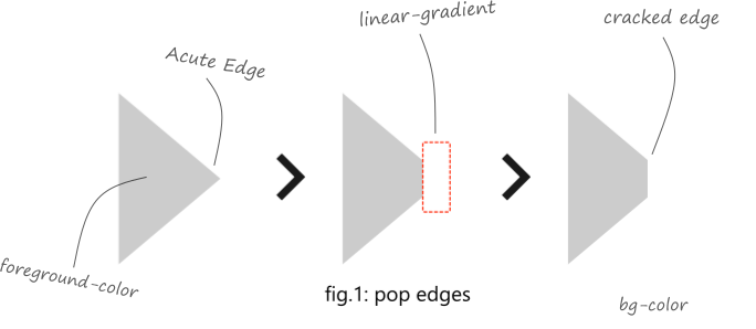
Opposed to pop-edges, we can add a foreground-colored rectangle (or circle/oval) to the corner side (which is foreground as well). So the edges would look poured. Now we can apply a circle (or an oval) over the poured edges with a specific border-radius and outlined thick borders. Thus it will look way smoother,

In both cases, the rectangle, oval, outlined rectangle, etc. are pseudo-elements that we're talking about, and the poped/poured edges are stacked CSS gradients. Handling many stacked gradients can be tough as we've to take care of so many numbers at the same time. So we can divide the stacks into pieces and place them in the <div> elements as comfortable. Although all div are already stacked.
So, our code would be:
.brave-logo .mask::before{
/* pop edges */
background-image:
		 linear-gradient(var(--primary-color), var(--primary-color)),
		 linear-gradient(var(--fill-color), var(--fill-color)),
		 linear-gradient(var(--fill-color), var(--fill-color)),
		 linear-gradient(var(--secondary-color), var(--secondary-color)),
		 linear-gradient(var(--primary-color), var(--primary-color));

background-size:
		 71px 11px,
		 32px 11px,
		 32px 11px,
		 32px 69px,
		 32px 69px;
background-position:
		 50% 1px,
		 154px 18px,
		 315px 18px,
		 -20px 98px,
		 481px 98px;

background-repeat: no-repeat;
}

/* area for inner figure and extended figure */
.brave-logo .mask > .i{
top: 0;
width: 100%;
height: 76.05%;

/* fill for sharp edges */
background-image: linear-gradient(-21.2deg, var(--fill-color) 49.4%,transparent 51.2%), linear-gradient(-119deg, var(--fill-color) 49%,transparent 50.3%), linear-gradient(20.6deg, var(--fill-color) 49.4%,transparent 51.2%), linear-gradient(118deg, var(--fill-color) 49%,transparent 50.3%);
/* linear-gradient(-21.2deg, var(--fill-color) 50%,transparent 50%), linear-gradient(-119deg, var(--fill-color) 50%,transparent 50%), linear-gradient(20.6deg, var(--fill-color) 50%,transparent 50%), linear-gradient(118deg, var(--fill-color) 50%,transparent 50%) */
background-size: 15% 13%, 15% 13%, 15% 13%, 15% 13%;
background-position: 77.6% 27.12%, 68.8% 53%, 22.6% 27.4%, 31.29% 53%;
}

.brave-logo .mask > .e{
left: 50%;
bottom: 0%;
width: 41.42%;
height: 27.2%;
transform: translateX(-50%);
}

/* blob pairs and curved shapes */
.brave-logo .i .b,
.brave-logo .e .b{
position: absolute;
left: 0;
top: 0;
width: 100%;
height: 100%;
background-repeat: no-repeat;
}

.brave-logo .b::before,
.brave-logo .b::after{
content: "";
position: absolute;
display: block;
box-shadow: 0 0 0 1px rgba(0,0,0,0);
box-sizing: border-box;
}

.brave-logo .i .b1{
background-image: linear-gradient(-20.2deg, var(--fill-color) 49%,transparent 51.2%), linear-gradient(20.2deg, var(--fill-color) 49%,transparent 51.2%);
/*linear-gradient(-20.2deg, var(--fill-color) 50%,transparent 50%), linear-gradient(20.2deg, var(--fill-color) 50%,transparent 50%);*/
background-size: 34px 20px, 34px 20px;
background-position: 198px 0px, 273px 0px;
}

.brave-logo .i .b1::before{
left: 208px;
top: 0px;
background: var(--fill-color);
border-radius: 50%;
width: 89px;
height: 66px;
transform: rotate(0deg);
}

.brave-logo .i .b1::after{
left: 123px;
top: -41px;
border-bottom: 4px solid var(--fill-color);
border-radius: 50%;
width: 94px;
height: 66px;
transform: rotate(-1.3deg);
clip-path: polygon(214% 6%, -77% 29%, 100% 100%, 12% 97%);
}

.brave-logo .i .b2::after{
right: 125px;
top: -41px;
border-bottom: 4px solid var(--fill-color);
border-radius: 50%;
width: 94px;
height: 66px;
transform: rotate(3deg);
clip-path: polygon(214% 6%, -77% 29%, 100% 100%, 12% 97%);
}

.brave-logo .i .b2{
background-image: linear-gradient(50.2deg, var(--fill-color) 50%,transparent 50%);
background-size: 55px 88px;
background-position: 440px 35px;
}

.brave-logo .i .b2::before{
right: 0px;
top: 92px;
border-radius: 50%;
width: 156px;
height: 88px;
transform: rotate(2deg);
background: var(--fill-color);
clip-path: polygon(48% 25%, 100% -152px, 100% 100%, 46% 110%);
}

.brave-logo .i .b3::before{
right: 0px;
top: 92px;
border-radius: 0%;
width: 32px;
height: 88px;
background-image: linear-gradient(var(--fill-color) 50%,transparent 50%);
clip-path: polygon(29% 0.4%, 64.7% 20%, 100% 45%, 82% 71%, 63% 80%, 25% 94%);
background-size: 28px 161px;
background-position: 0 0;
background-repeat: no-repeat;
}

.brave-logo .i .b3::after{
left: 1px;
top: 81px;
border-radius: 50%;
width: 180px;
height: 108px;
transform: rotate(0deg);
background: var(--fill-color);
clip-path: polygon(0 0, 10% 36%, 49% 75%, 0px 100%);
}

.brave-logo .i .b3{
background-image: linear-gradient(var(--fill-color), var(--fill-color)), linear-gradient(var(--fill-color), var(--fill-color)), linear-gradient(var(--fill-color), var(--fill-color)), linear-gradient(var(--fill-color), var(--fill-color)), linear-gradient(var(--primary-color), var(--primary-color)), linear-gradient(var(--secondary-color), var(--secondary-color));
background-size: 24px 17px, 24px 17px, 24px 20px, 24px 20px, 10px 10px, 10px 10px;
background-position: 59px 80px, 421px 80px, 385px 251px, 97px 254px, 257px 293px, 234px 293px;
}

.brave-logo .i .b4::before{
left: 76px;
top: 87px;
border-radius: 50%;
width: 33px;
height: 10px;
transform: rotate(11deg);
background: var(--secondary-color);
}

.brave-logo .i .b4::after{
right: 76px;
top: 87px;
border-radius: 44%;
width: 33px;
height: 9px;
transform: rotate(-11.7deg);
background: var(--primary-color);
}

.brave-logo .i .b5::before {
left: 35px;
bottom: 83px;
border-radius: 50%;
width: 67px;
height: 45px;
transform: rotate(-25deg);
background: var(--secondary-color);
}

.brave-logo .i .b5::after{
right: 44px;
bottom: 87px;
border-radius: 50%;
width: 58px;
height: 44px;
transform: rotate(9deg);
background: var(--primary-color);
}

.brave-logo .i .b6::after {
right: 85px;
bottom: 1px;
border-radius: 0% 75% 56% 51% / 0% 45% 66% 100%;
width: 100px;
height: 100px;
transform: rotate(-10deg);
background: var(--fill-color);
}

.brave-logo .i .b6::before{
right: 86px;
bottom: 9px;
border-radius: 42px 1px 50px 50px;
width: 107px;
height: 100px;
transform: rotate(-23deg);
background: var(--fill-color);
}

.brave-logo .i .b7::before{
right: 104px;
bottom: 16px;
border-radius: 50%;
width: 138px;
height: 70px;
transform: rotate(38deg);
border-bottom: 10px solid var(--fill-color);
}

.brave-logo .i .b7::after {
right: 196px;
bottom: 64px;
border-radius: 50%;
width: 48px;
height: 25px;
transform: rotate(3deg);
background: var(--fill-color);
}

.brave-logo .i .b8::before{
left: 104px;
bottom: 16px;
border-radius: 50%;
width: 137px;
height: 70px;
transform: rotate(-35deg);
border-bottom: 10px solid var(--fill-color);
}

.brave-logo .i .b8::after{
left: 190px;
bottom: 66px;
border-radius: 50%;
width: 53px;
height: 23px;
transform: rotate(1.8deg);
background: var(--fill-color);
}

.brave-logo .i .b9::before{
left: 82px;
bottom: 3px;
border-radius: 52% 0 42% 61% / 26% 30% 54% 70%;
width: 102px;
height: 104px;
transform: rotate(22.4deg);
background: var(--fill-color);
}

.brave-logo .i .b9::after{
left: 194px;
bottom: 51px;
border-radius: 50%;
width: 57px;
height: 10px;
transform: rotate(-45.6deg);
background: var(--fill-color);
}

.brave-logo .i .b4{
background-image: linear-gradient(var(--fill-color), var(--fill-color)), linear-gradient(var(--fill-color), var(--fill-color)), linear-gradient(var(--fill-color), var(--fill-color)), linear-gradient(var(--fill-color), var(--fill-color));
background-size: 20px 8px, 20px 8px, 20px 10px, 20px 10px;
background-position: 155px 74px, 340px 74px, 215px 97px, 270px 97px;
}

.brave-logo .i .b10::before{
left: 135px; /*137 135*/
top: 85px;
border-radius: 21px 9px;
width: 84px; /*82 84*/
height: 37px;
transform: rotate(16.4deg);
background: var(--secondary-color);
}

.brave-logo .i .b10::after{
right: 134px;
top: 87px;
border-radius: 9px 11px 22px 19px;
width: 86px;
height: 37px;
transform: rotate(-14.4deg);
background: var(--primary-color);
}

.brave-logo .i .b5{
background-image: linear-gradient(var(--fill-color),var(--fill-color)), linear-gradient(var(--fill-color), var(--fill-color));
background-size: 10px 13px, 10px 10px;
background-position: 152px 223px, 340px 225px;
}

.brave-logo .i .b11::before{
left: 160px;
top: 207px;
border-radius: 8px 9px;
width: 20px;
height: 32px;
transform: rotate(-151.6deg);
background: var(--secondary-color);
}

.brave-logo .i .b11::after{
right: 162px;
top: 201px;
border-radius: 14px 20px;
width: 24px;
height: 39px;
transform: rotate(150deg);
background: var(--primary-color);
}

.brave-logo .i .b6{
background-image: linear-gradient(var(--secondary-color),var(--secondary-color)), linear-gradient(var(--primary-color),var(--primary-color));
background-size: 10px 10px, 10px 10px;
background-position: 197px 225px, 298px 225px;
}

.brave-logo .i .b12::before{
left: 202px;
top: 214px;
border-radius: 9px;
width: 21px;
height: 20px;
transform: rotate(97deg);
background: var(--fill-color);
}

.brave-logo .i .b12::after{
right: 201px;
top: 214px;
border-radius: 19px;
width: 19px;
height: 20px;
transform: rotate(-6deg);
background: var(--fill-color);
}

.brave-logo .e .b13::before{
right: -3px;
bottom: 94px;
border-radius: 40% 60% 70% 30% / 49% 51% 49% 51%;
width: 123px;
height: 22px;
transform: rotate(25deg);
background: var(--fill-color);
}

.brave-logo .e .b13::after{
right: 0px;
bottom: 81px;
border-radius: 22px;
width: 37px;
height: 14px;
transform: rotate(28deg);
background: var(--fill-color);
}

.brave-logo .e .b14::before{
right: 99px;
bottom: 100px;
border-radius: 7% 60% 70% 30% / 49% 51% 49% 51%;
width: 112px;
height: 14px;
transform: rotate(-27.7deg);
background: var(--fill-color);
}

.brave-logo .e .b14::after{
left: 34px;
bottom: 11px;
border-radius: 9px;
width: 101px;
height: 135px;
transform: rotate(-51.4deg);
background: var(--fill-color);
box-shadow: 0 0 0 1px rgba(0,0,0,0);
clip-path: polygon(0% 0%, 5% 5%, 100% 100%, 0% 100%);
}

.brave-logo .e .b14{
background-image: linear-gradient(143.1deg, var(--fill-color) 50%, transparent 50%), linear-gradient(141.7deg, var(--fill-color) 50%, transparent 50%);
background-size: 101px 70px ,102px 70px;
background-position: 110px 54px, 103px 60px;
}

.brave-logo .e::after{
content: "";
position: absolute;
right: 51px;
bottom: -20px;
background: var(--fill-color);
width: 4px;
height: 121px;
transform: rotate(51.8deg);
box-shadow: 0 0 0 1px rgba(0,0,0,0);
display: block;
}

.brave-logo .e::before{
content: "";
position: absolute;
left: 8px;
top: 39px;
background: var(--fill-color);
width: 19px;
height: 30px;
transform: rotate(-52deg);
box-shadow: 0 0 0 1px rgba(0,0,0,0);
display: block;
z-index: 4;
border-radius: 7px;
clip-path: polygon(0 0, 48% 0, 33% 42%, 0 41%);
}

/* almost forget, we didn't add this one */
.brave-logo .mask > .i::before,
.brave-logo .mask > .i::after{
content: "";
position: absolute;
top: 31.278%;
width: 12%;
height: 19%;
background: var(--fill-color);
border-radius: 37%;
display: block;
box-shadow: 0 0 0 1px rgba(0,0,0,0);
}

.brave-logo .mask > .i::before{
left: 63.19%;
transform: rotate(64deg);
border-radius: 46px 0% 37% 37%;
}

.brave-logo .mask > .i::after{
left: 24.63%;
transform: rotate(112deg);
border-radius: 37% 26px;
}
Yes, it's a bit longer but based on the above concept.
Step 6. Scalability
Our logo is almost ready.
Now only one thing left, that's scalability. All coordinates were in pixels, so they're quite not responsive. We can still resize it ingeniously, like this:
.brave-logo {
    --dimensions: 768;
    width: calc(var(--dimensions) * 1px);
    height: calc(var(--dimensions) * 1px);
}

.brave-logo .logo {
    transform: scale(calc(var(--dimensions) / 768));
    transform-origin: 0% 0%;
}
Here things got a bit interesting. We're setting the dimensions comparing its current dimensions with 768! (How crazy is that? :D)
We're doing this to perform a uniform scale without even breaking the logo. Hopefully the clip-path coordinates were responsive.
Note: The --dimensions variable must be an integer between 1-768 or higher, to avoid complex calc() algorithms that could flatter on most mobile browsers.
Step 7. Major imperfections
While we've tried to make it as accurate as possible, there is still some problem we might encounter.
- First of all, CSS is rendered in different ways in different browsers, so the properties.
- CSS gradients might appear sharp or antialiased on Chromium browsers, we can get rid of them using irrational gradients, just what we did in Step-3 and further ones.
- The curves/blobs might get misplaced in Firefox as the design was made in Chrome, so we've to account for both of them individually and target one of them. For example:
/* optimization for FireFox */
@supports ( -moz-appearance:none ){

.brave-logo .i .b5::before{
left: 35px;
bottom: 82px;
height: 47px;
}

.brave-logo .i .b5::after{
height: 45px;
transform: rotate(11deg);
}

.brave-logo .i .b11::after{
right: 161px;
transform: rotate(157deg);
}

.brave-logo .mask > .i::before,
.brave-logo .mask > .i::after{
top: 31.188%;
}

.brave-logo .i .b12::before{
left: 201px;
border-radius: 8px;
}

.brave-logo .i .b12::after{
top: 215px;
transform: rotate(79deg);
}

}
Step 8. The live view
Disclaimer
The Brave logo is copyrighted by Brave and is used with Brave’s permission. Thanks to them :)
Summary
Et voilà, we've created the Brave logo with CSS.
I hope you've enjoyed this tutorial and you've learnt a bit about CSS. Feel free to contact me for questions you may have.
Happy Coding.
I would like to send a very special thank to @ShadowShahriar (he knows why).


